
Brand Identity · Creative Direction · Packaging Design · Illustration
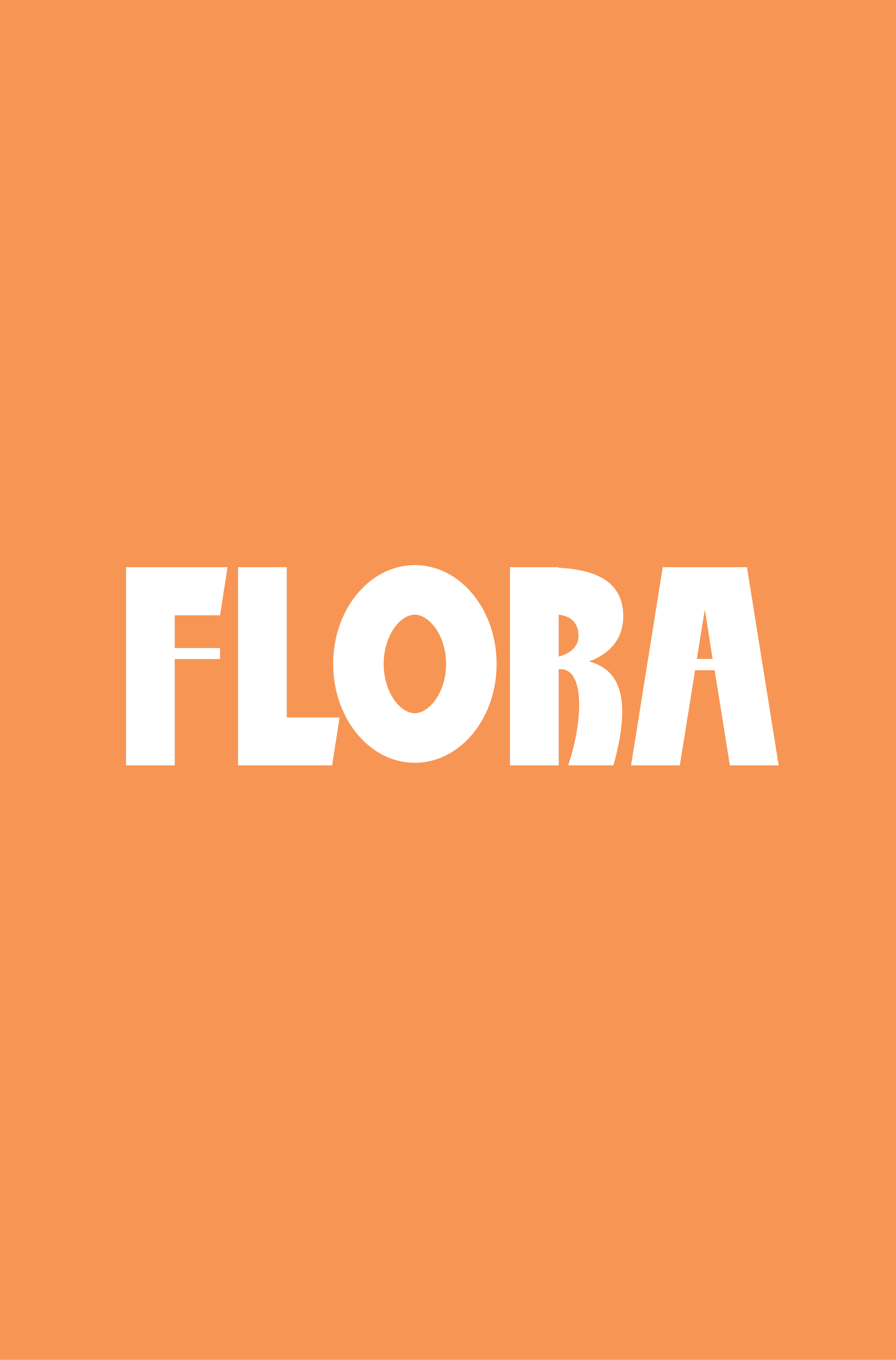
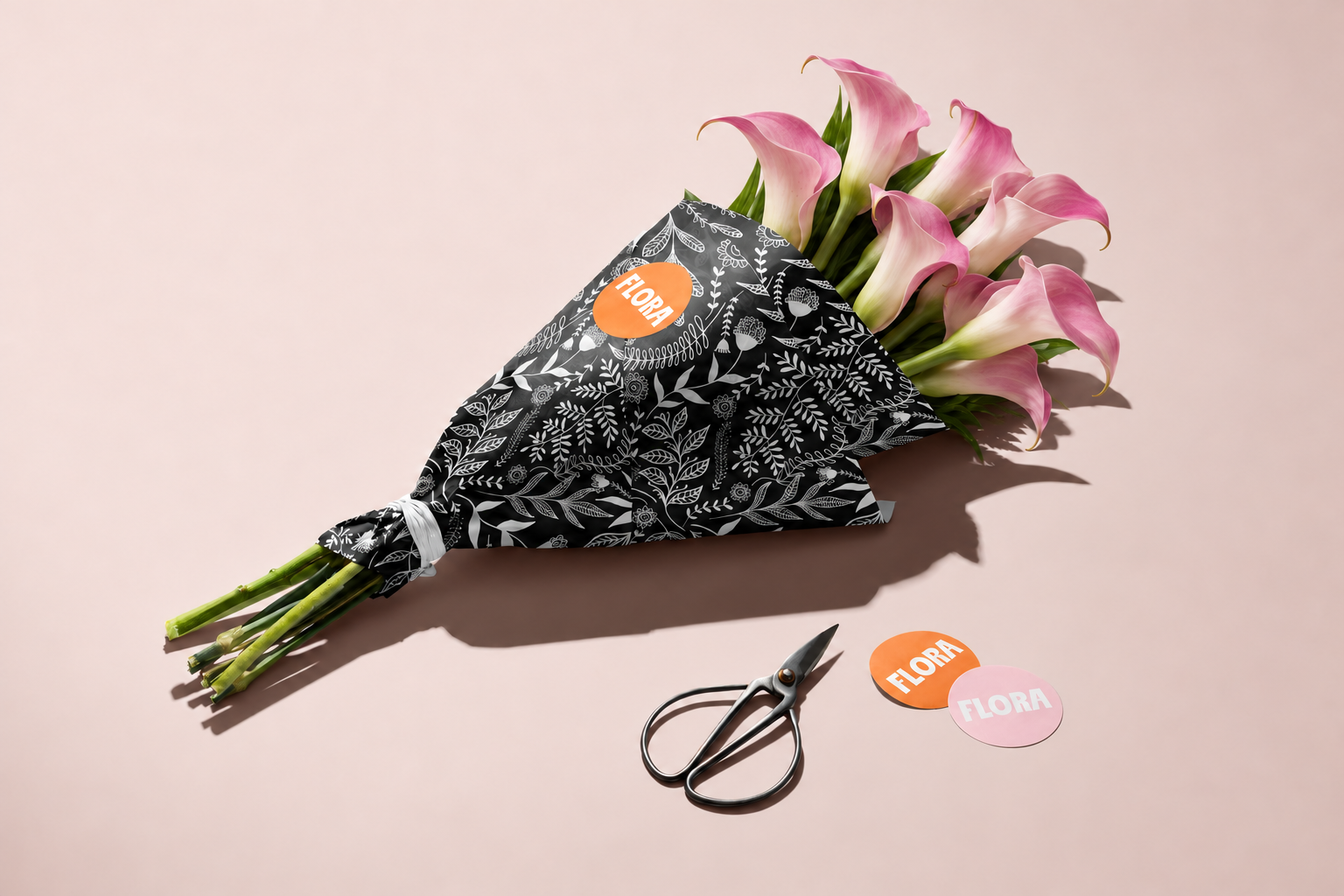
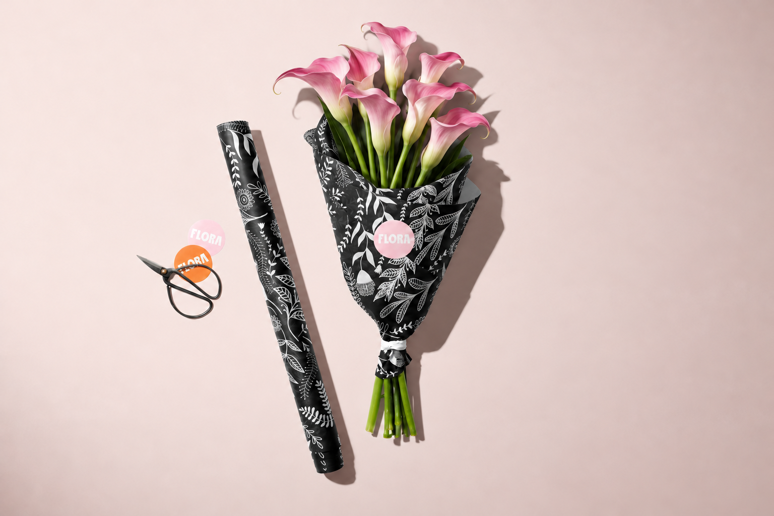
Flora is a conceptual florist brand with a playful, contemporary identity. The logo pairs bold, expressive lettering with a soft pink palette and vibrant orange accents, while intricate botanical illustrations bring detail to the packaging. Applied across bouquet wrapping and branded stickers, the identity creates a distinctive gifting experience, framing the flowers with personality and care.
LOCATION
MELBOURNE, AUSTRALIA
YEAR COMPLETED
2026
DESIGN PHILOSOPHY
A LITTLE JOY, BEAUTIFULLY WRAPPED.
Brand identity, packaging and illustration for Flora, a conceptual florist celebrating the joy of giving and receiving flowers.
The concept explores how a florist’s identity can become part of the gift itself. From the logo to the bouquet wrapping, each element brings personality to the presentation while giving the flowers room to shine.
BOLD LETTERING. BOTANICAL DETAIL.
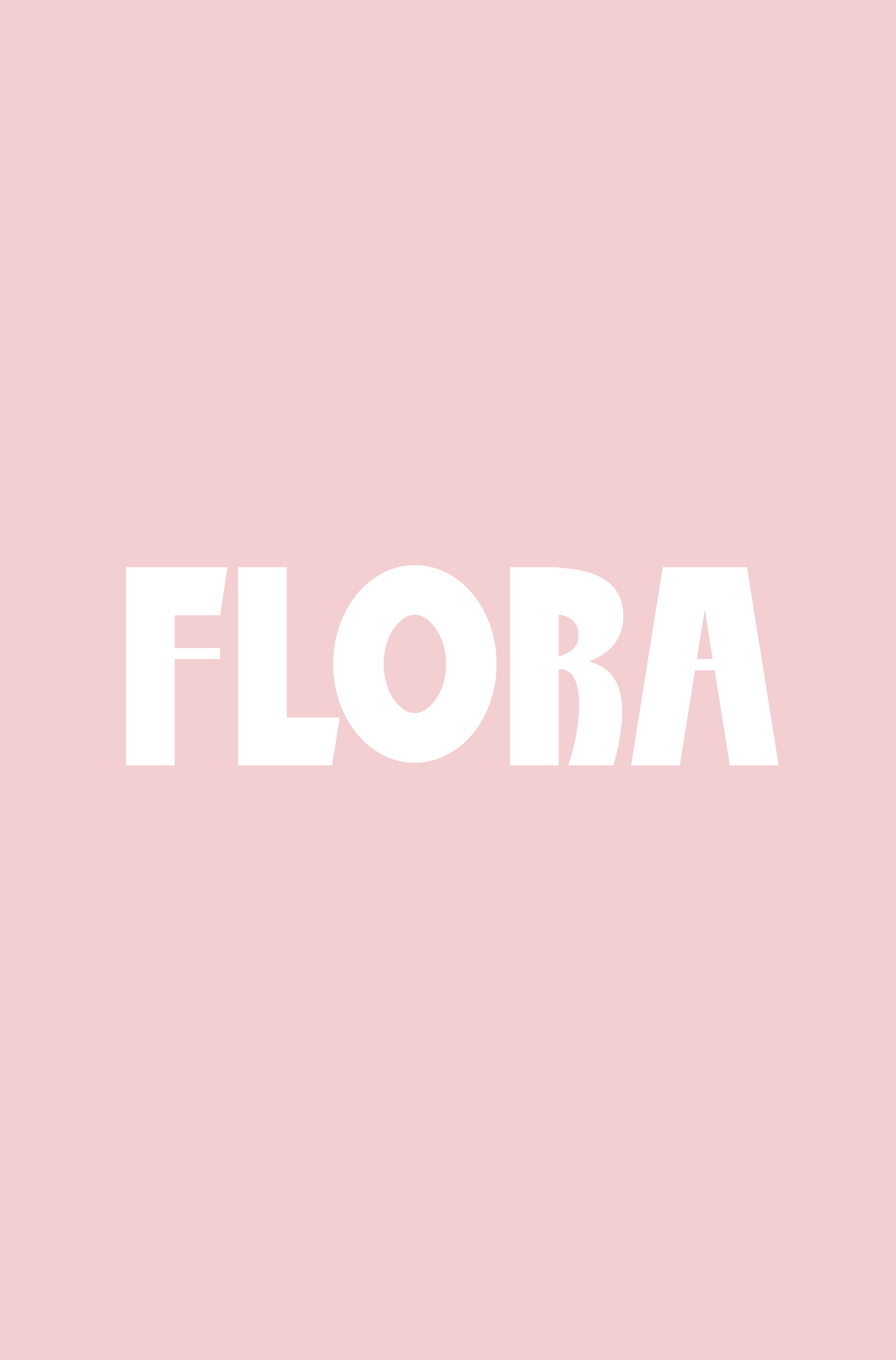
The logo introduces Flora through bold, playful typography with expressive shapes. Soft pink and vibrant orange bring warmth and energy, balanced by the graphic contrast of black and white. The combination feels fresh and approachable, with a distinctive presence across the brand.
AN IDENTITY THAT BLOOMS ON PAPER.
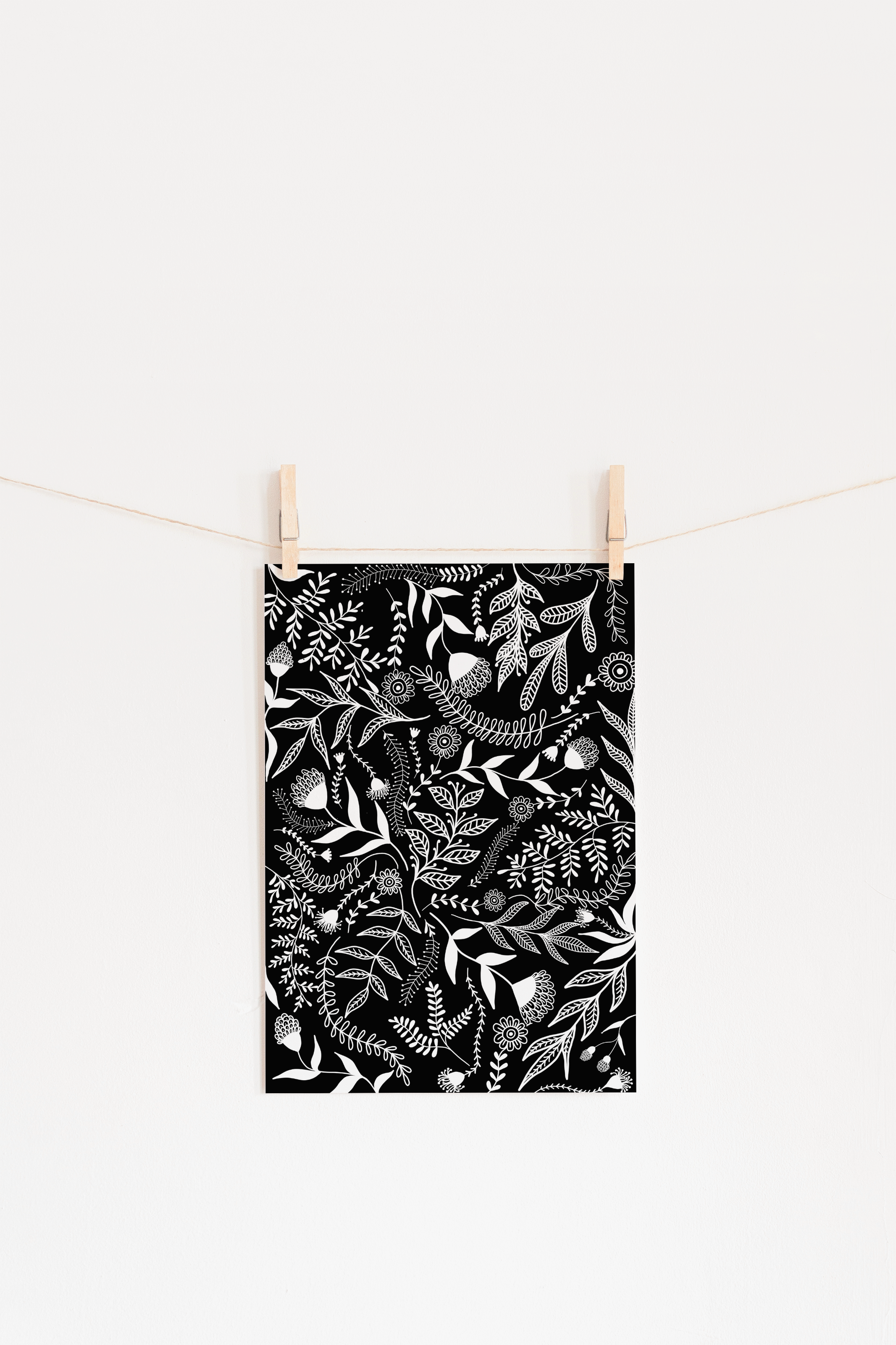
Intricate botanical illustrations add texture and movement to the packaging. Across the bouquet wrapping, illustrated leaves and flowers contrast with the simplicity of the logo, creating a balance between delicate detail and confident form. Circular branded stickers complete the presentation with a bright finishing touch.
Together, the logo, illustration and packaging create a cohesive identity that makes every bouquet feel like a considered gift, from the first impression to the final unwrapping.
BREAKDOWN