Brand Identity · Packaging Design · Illustration
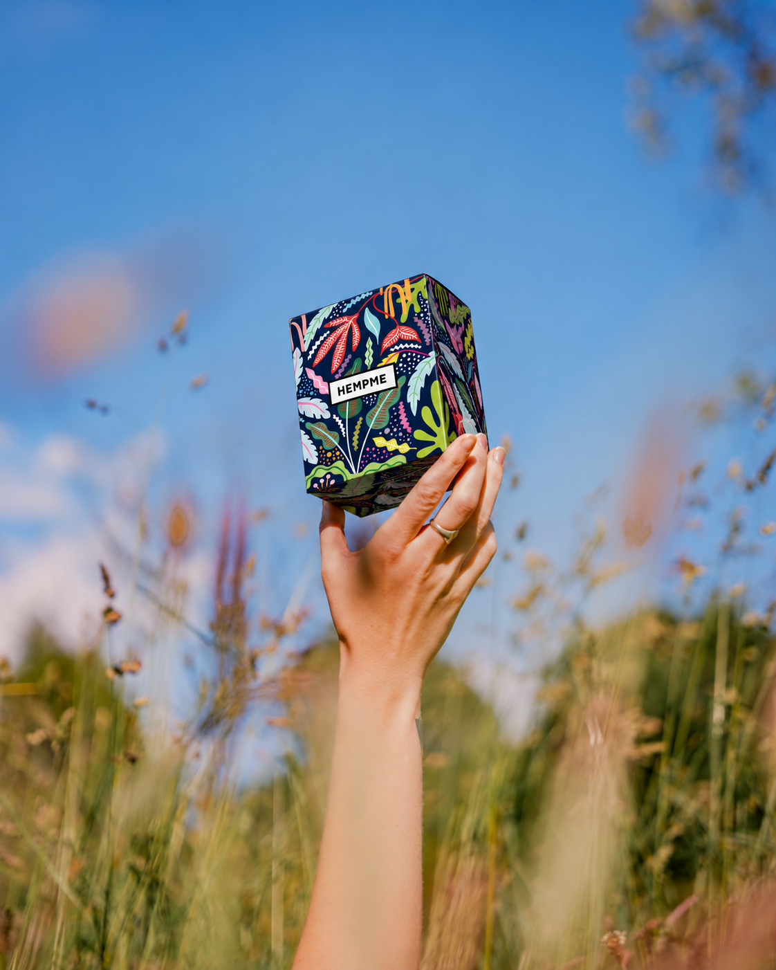
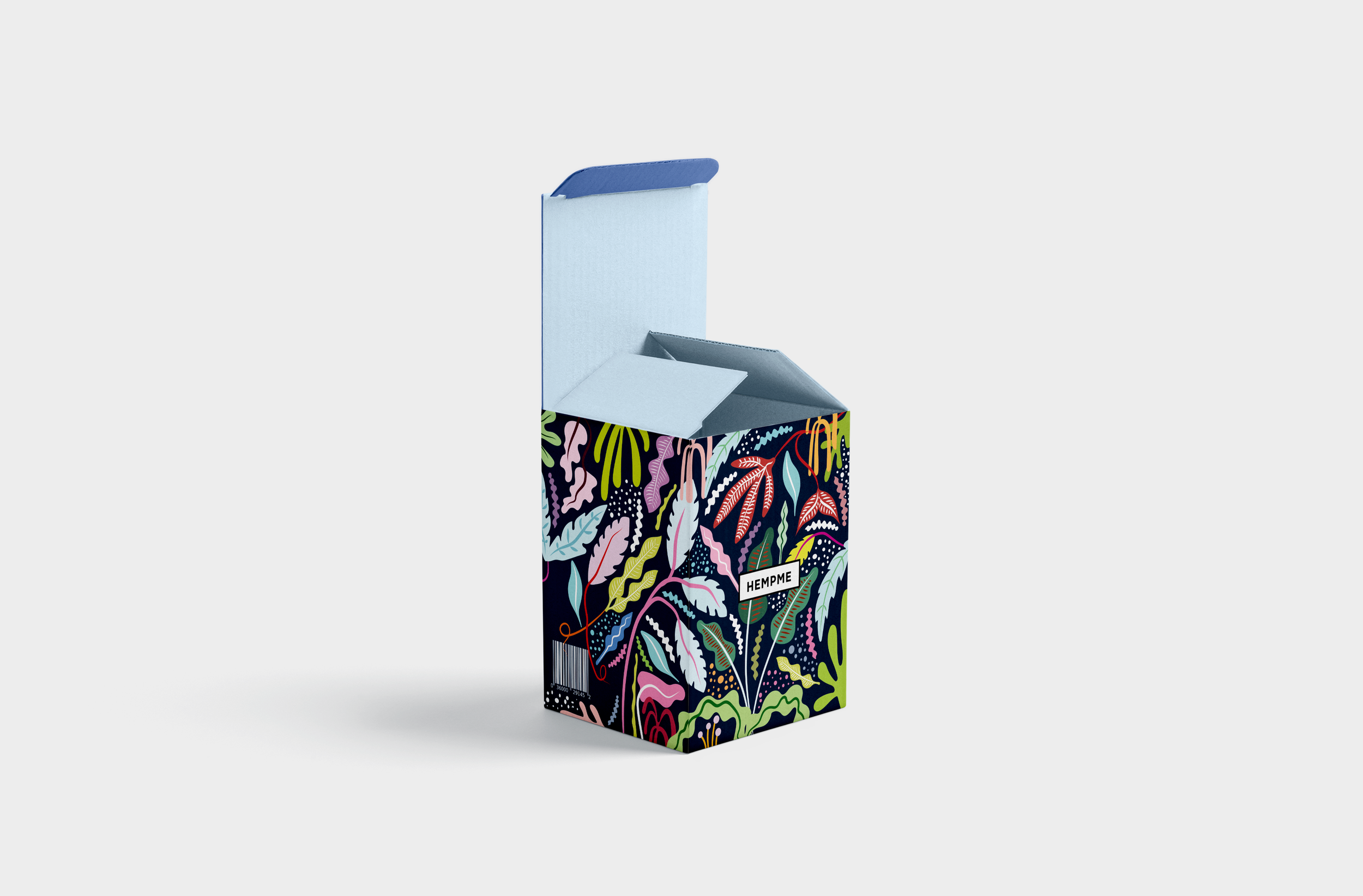
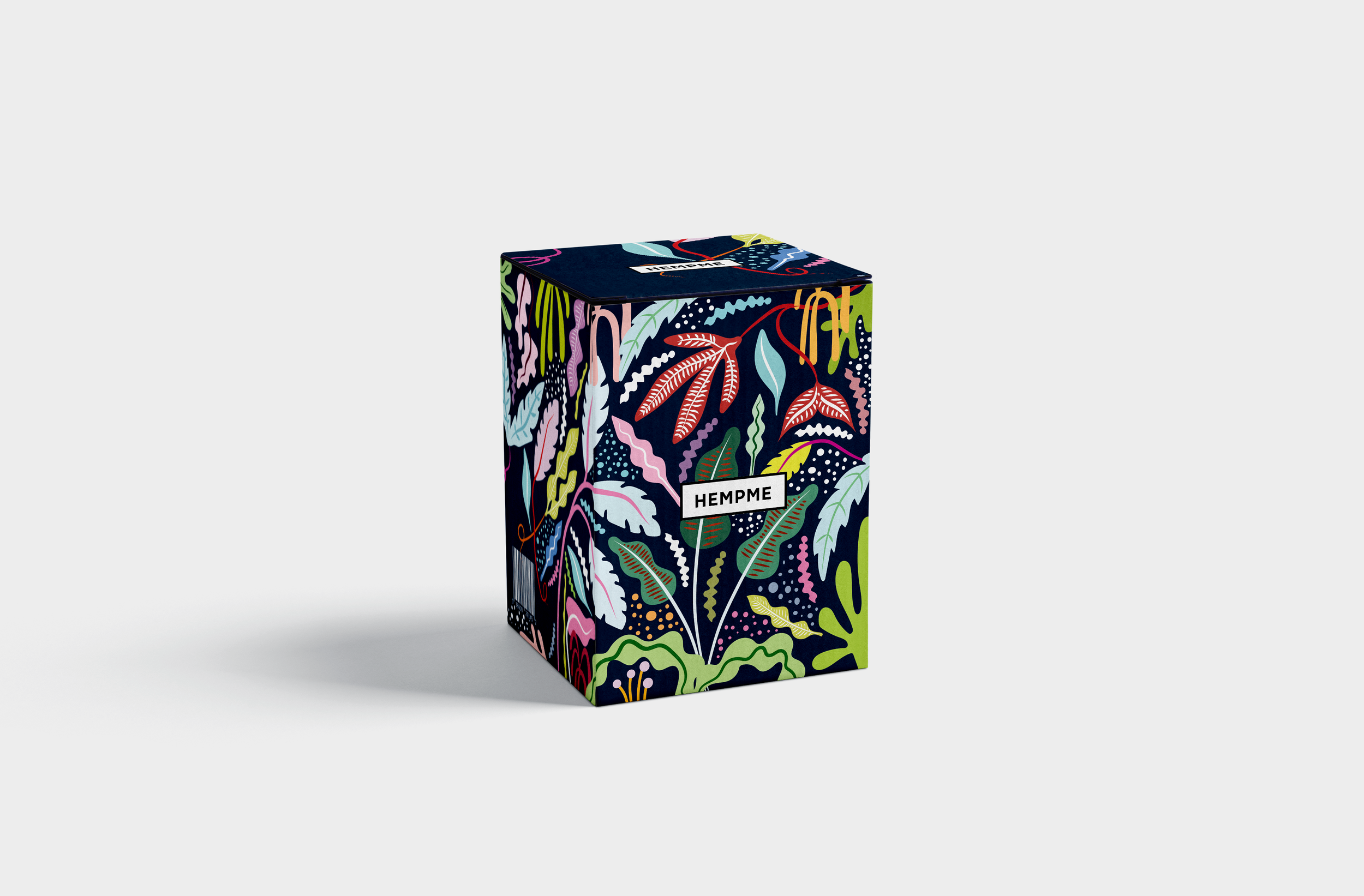
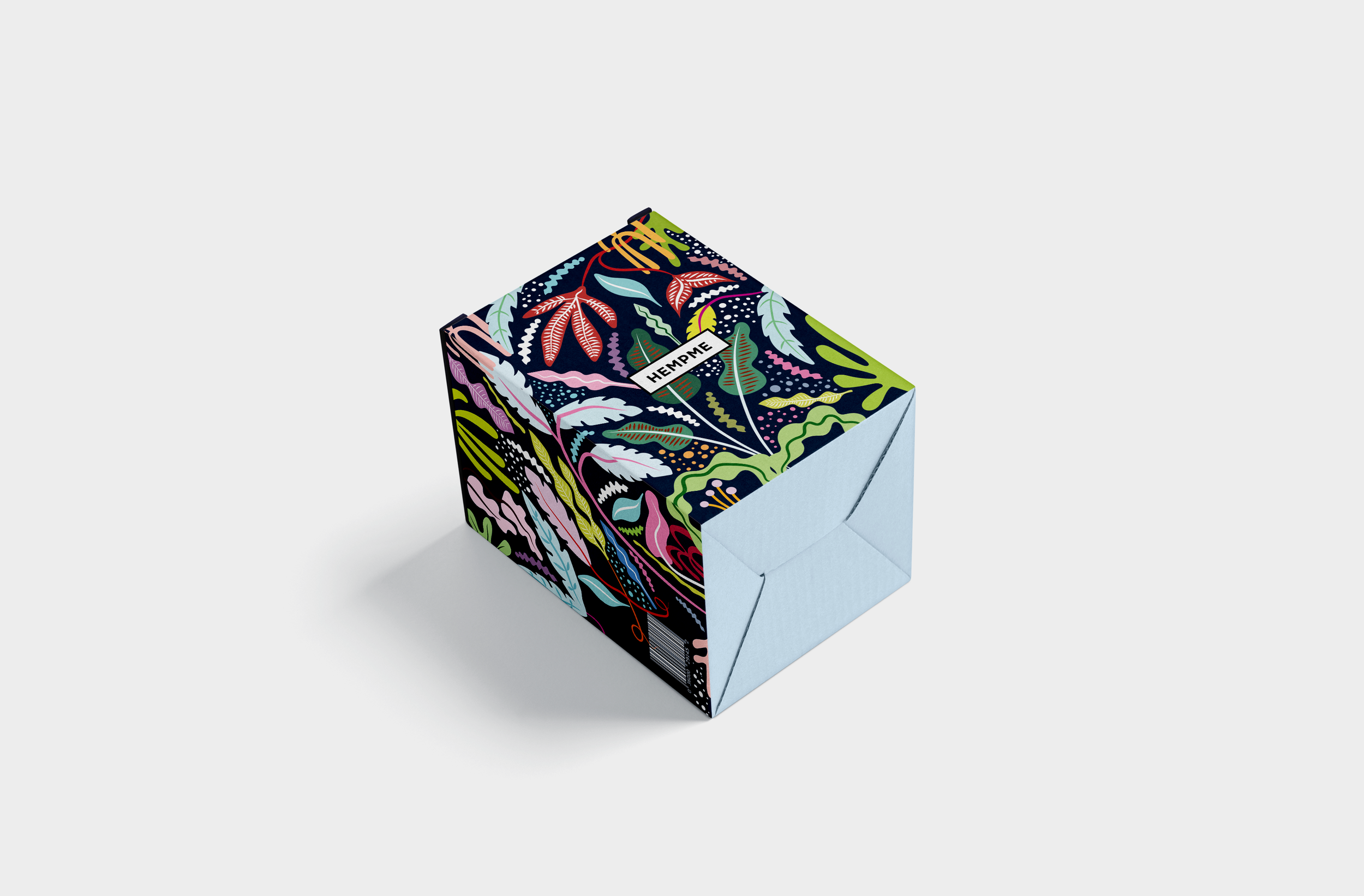
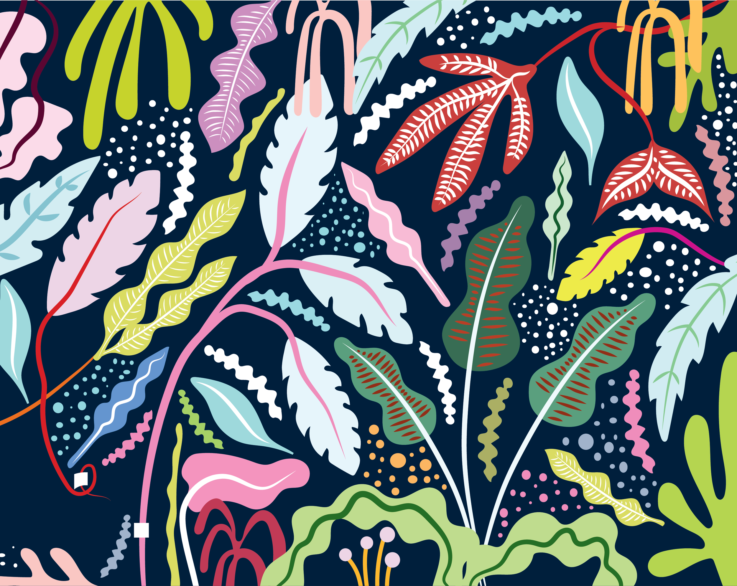
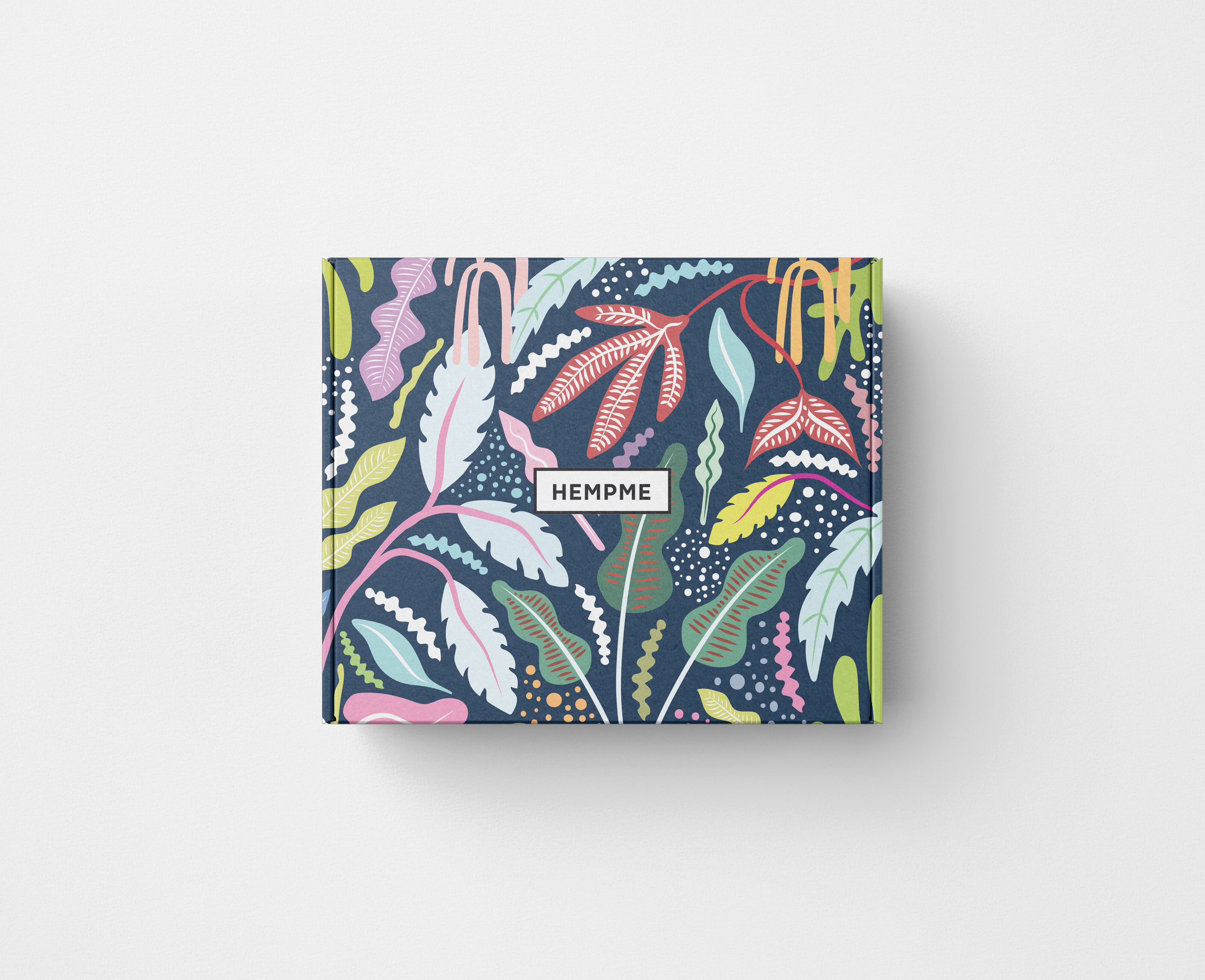
Packaging design for Hempme, bringing botanical inspiration to life through expressive pattern and colour. Layered foliage in soft pastels and vivid accents sits against a deep navy background, creating a distinctive composition. A simple framed brand mark anchors the design, balancing the intricate artwork with clarity.
LOCATION
AUSTRALIA
YEAR COMPLETED
2017
DESIGN PHILOSOPHY
NATURE, WITH PERSONALITY.
Packaging design for Hempme, exploring a bold and expressive approach to botanical imagery.
The design draws on the shapes, textures and movement of foliage, translating them into packaging with a playful, contemporary presence. Rich colour and intricate pattern create visual interest, while a clear brand focal point brings balance to the composition.
ORGANIC FORMS. UNEXPECTED COLOUR.
Illustrated leaves, winding stems and scattered dots form a layered botanical pattern. Soft pinks, pale blues and greens sit alongside brighter coral and yellow accents, grounded by a deep navy background. The palette gives familiar natural forms a fresh interpretation, with fine linework adding depth and detail.
PATTERN THAT WRAPS THE PACKAGE.
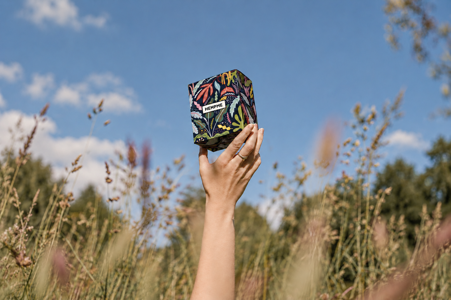
The artwork extends across the box, creating a continuous composition that reveals different details as the packaging is handled. The restrained Hempme brand mark sits within a contrasting rectangular frame, allowing the name to remain clear amid the surrounding pattern.
Together, the botanical artwork, colour palette and considered layout give Hempme a distinctive packaging presence, balancing visual richness with simple, confident branding.
BREAKDOWN